The DOUBLE ShIELD
UPS Brand Refresh
With a legacy of trust and a future of innovation, UPS is doubling down on the commitment to sustainability & dependability with this brand update.
ROLE: BRAND IDENTITY, ART DIRECTION, CONSUMER RESEARCH, BRIEF CREATION
CASE STUDY: ARGD 4020


-
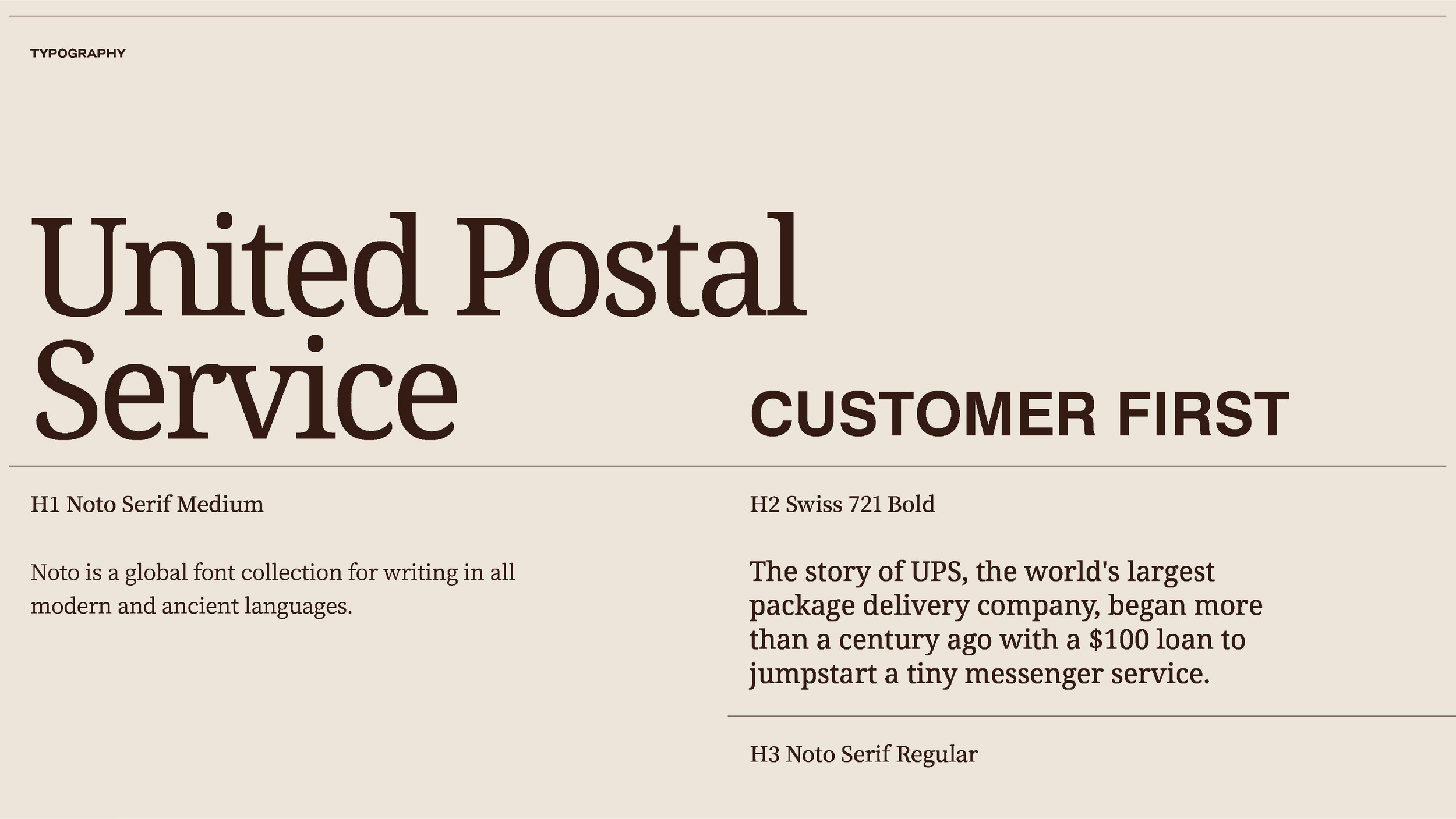
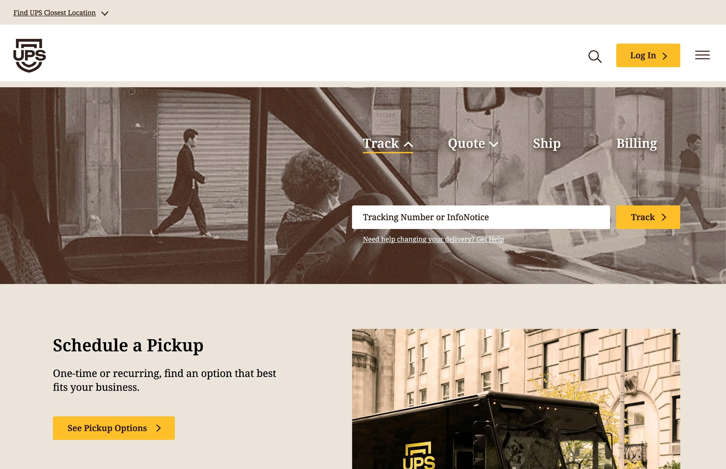
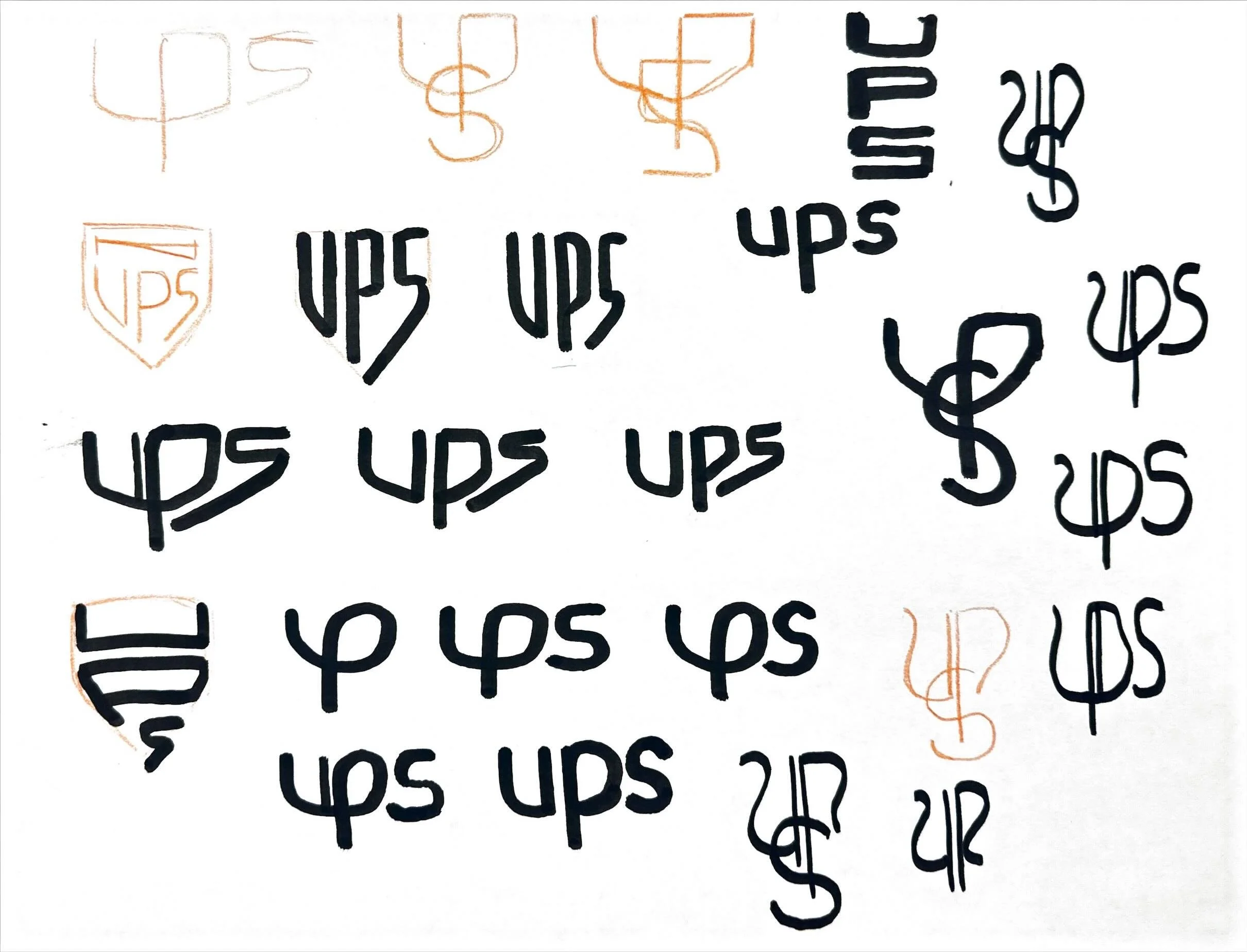
UPS is innovative, dependable, and friendly, like your neighborhood UPS driver. After crafting a report of the competitive landscape and extensive iteration, I applied a new identity system and presented it to UPS executives.
-
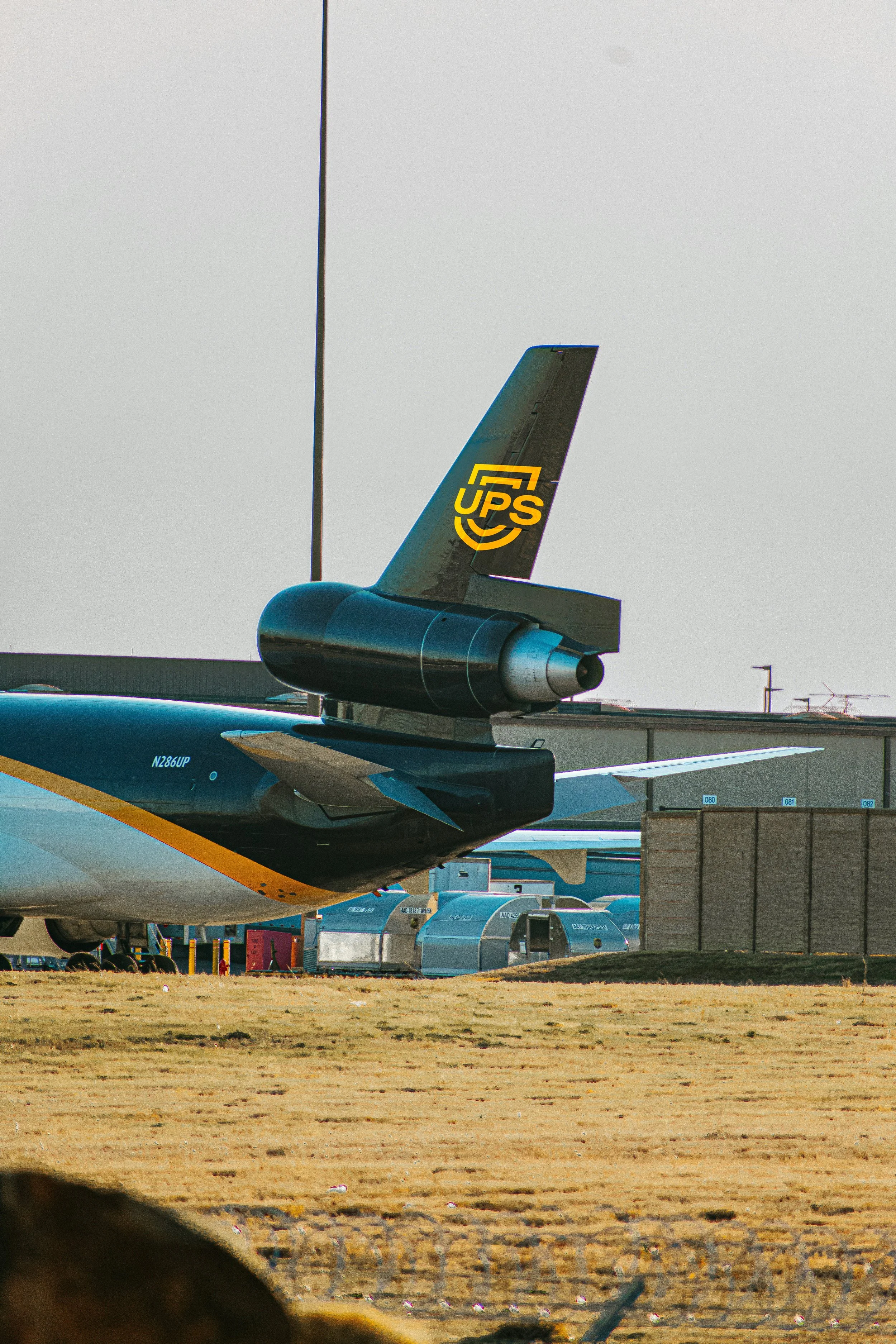
UPS has one of the most recognizable marks in the world. The simple, recognizable shield logo evokes security and trust, reinforcing UPS's role in safe package delivery. With my take, I challenge UPS to double down on efforts in sustainability and innovation.
-
My classmates and I were fortunate to present to UPS creative executives, who were generous enough to offer feedback and choose a system as their favorite. I received an award for “Best Logo & Branding System.”